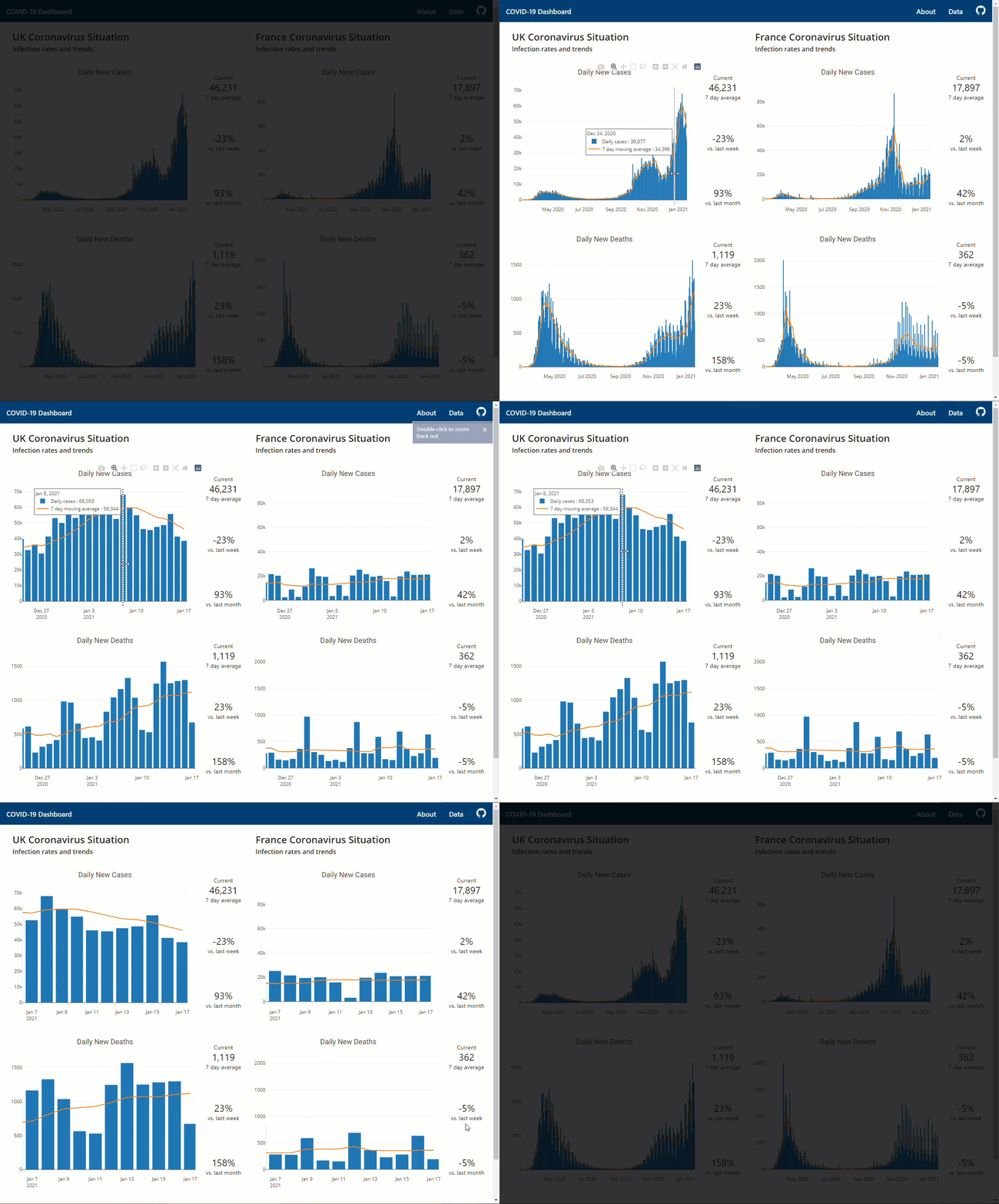
Using the wealth of data coming in to play with some of Python’s visualisation modules. This graph was created using a dataset readily available here from the European Centre for Disease Prevention and Control (ECDC).
Click the image to open fully.
.png)
The graph shows the downward trend in the number of deaths recorded and hopefully that we are over the peak.
This graph was created using the Matplotlib.pyplot module. It’s a ‘MATLAB-like plotting framework’, MATLAB being a popular software/environment/language used by many over the past 30 years.


