
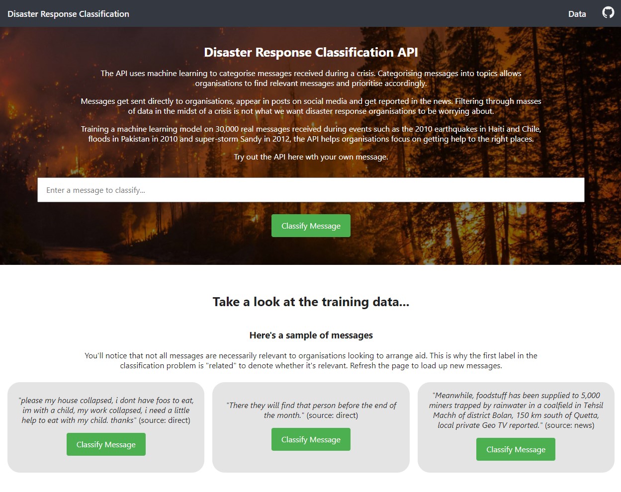
Taking a dataset from Appen containing 30,000 messages received during disasters in the last few decades, I created a machine learning pipeline to categorise messages into topics to allow aid orgainisations find relevant messages and prioritise accordingly.
During a crisis, organisations are overloaded with messages, coming directly, through the news or on on social media. Filtering through masses of data in the midst of a crisis is not what we want disaster response organisations to be worrying about. Using the API, organisations can filter out irrelevant messages.
 App screenshot
Imbalanced Data
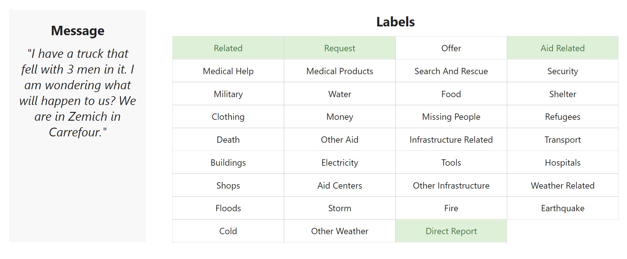
The data contained 30k real messages received during events such as the 2010 earthquakes in Haiti and Chile, floods in Pakistan in 2010 and super-storm Sandy in 2012. Each message is labeled with the categories or topics that it falls under.
Therefore we have a multilabel classifier problem with binary target variables, one of each of the 36 possible topics.
The most populous label is ‘relevant’, used to denote whether it is relevant to an organisation trying to help. 25% of the data is not relevant and unlabelled. Some categories such as ‘fire’ or ‘missing person’ have only 200 messages in the dataset and some have more than 10k. Therefore the dataset is imbalanced and this had to be taken into account during the model training.
Precision vs. Recall
With a dataset as imbalanced as the one used here, accuracy would not be a good measure. It rarely is useful on its own but especially here, the model only needs to correctly predict one message for a topic and classify the rest as negative and the model achieves 100% accuracy for that model.
We are more interested in recall as a measure since we would rather false flag a message to a disaster organisation than let it slip through the cracks. Therefore we use Fbeta as the performance measure. Fbeta is a generalisation of the F1-score, which is a metric that takes the harmonic mean of both precision and recall.
Since the F1-score is the harmonic mean, it gives more weight to low values and a good F1-score is only achieved if both precision and recall are high. However, as mentioned, we care slightly more about recall. We don’t mind falsely flagging messages to an aid organisation but we do care about false negatives. That’s why we use the Fbeta score where we can add more weight to recall.
Choosing SGD over XGBoost, Speed over Performance
To give more options about which classifier to use, we used MultiOutputClassifier which serves to extend classifiers to a multilabel problem such as this one. Running a grid search over various untuned classifiers, a few stuck out, namely Stochastic Gradient Descent (SGD) and then two ensemble boosting methods, AdaBoost and Extreme Gradient Boosting.
Both of the boosting methods provided better predictive ability over SGD but only by a small 2% margin (0.64 vs. 0.62). Since the computation time of using the boosting methods was at least 5 times higher than using the very efficient SGD classifier, I opted for the simpler linear classifier.
I must admit I did start out using XGBoost, because a 2% performance bump is still 2% but halfway through my first 60 minute+ grid search, I gave up and switched to SGD. This also works much better for the web app where users can try out their own messages. Here as well the impact on predict time was too great for me to continue using XGBoost.
Choosing a faster model, I was able to spend more time tuning hyperparameters, bringing the model’s F1 score to 65%.
 Example message from the training data and the result of the classifier
The Application
I used Flask to create an interface for the API. I’m a big fan of Flask for its ease of use and it’s flexibility. I also a fan of Streamlit but all apps look the same on Streamlit and this is down to Streamlit being so quick to quick an app up.
I wanted the app to be usable and engaging and used native CSS and HTML mostly, only utilising some inline JavaScript to handle a couple of features such as the top navigation and some Plotly customisations.
Message samples
 The sample messages change on each page load
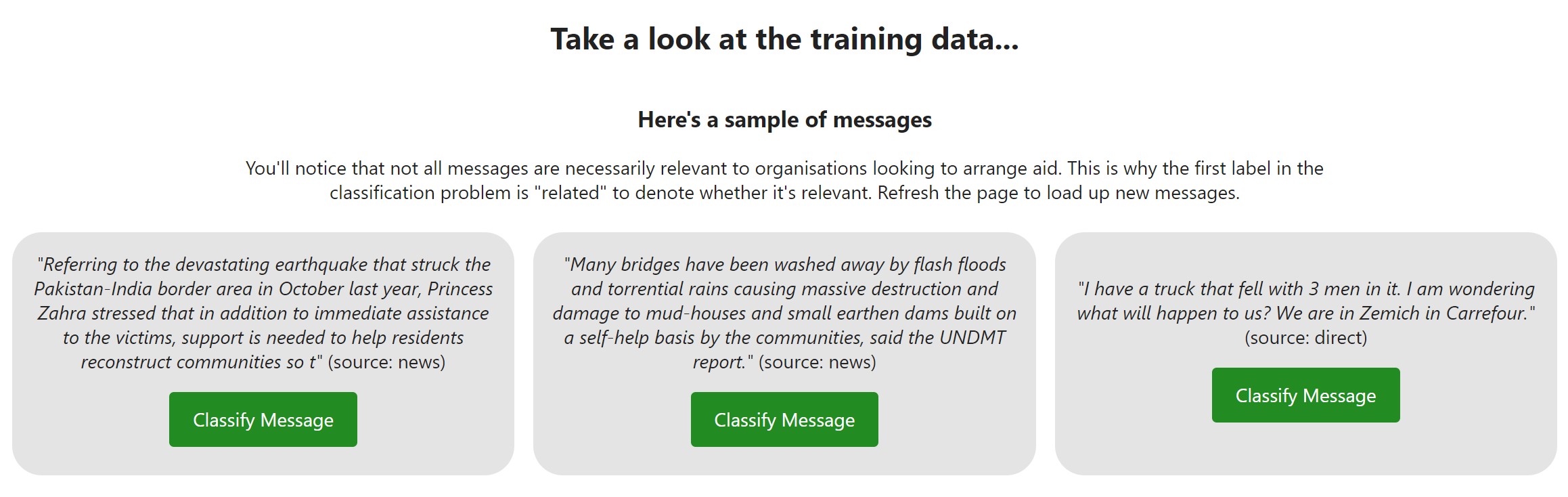
Whilst a text form is provided in the main section at the top of the page, I know that it’s too much effort to think up a message and write one out. Therefore, on page load, the app pulls out three messages from the training set so that users can see how they’re classified.
This coupled with the wordcloud below it also allow users to see what is contained in the training data and is much more effective a visualisation than bar charts (which I also threw in there).
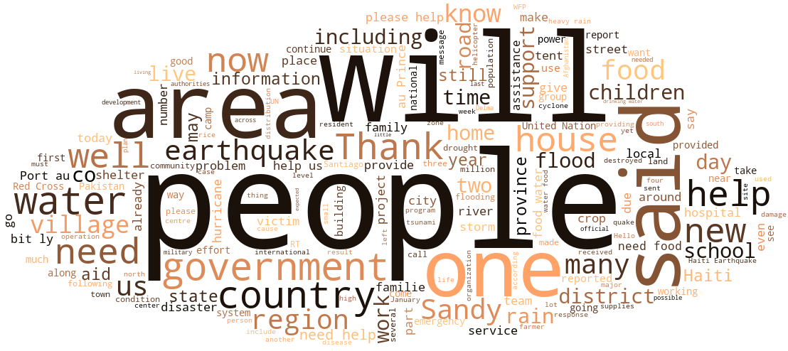 Word cloud from the 30,000 messages in the training data
I spent some time working on the Flask app because I think it’s important to produce something you want to show to people. Without a nice interface, only the hardcore are really going to want to interact with your work.
With More Time
With more time, I would have liked to dive into dealing with imbalanced data a bit further. Here, we bare it in mind as we look at F-scores averaged over the labels and looking at weighted vs. micro vs. macro averages but there are ways to directly address the imbalanced dataset that I don’t know very much about such as SMOTE, an oversampling technique.
Links
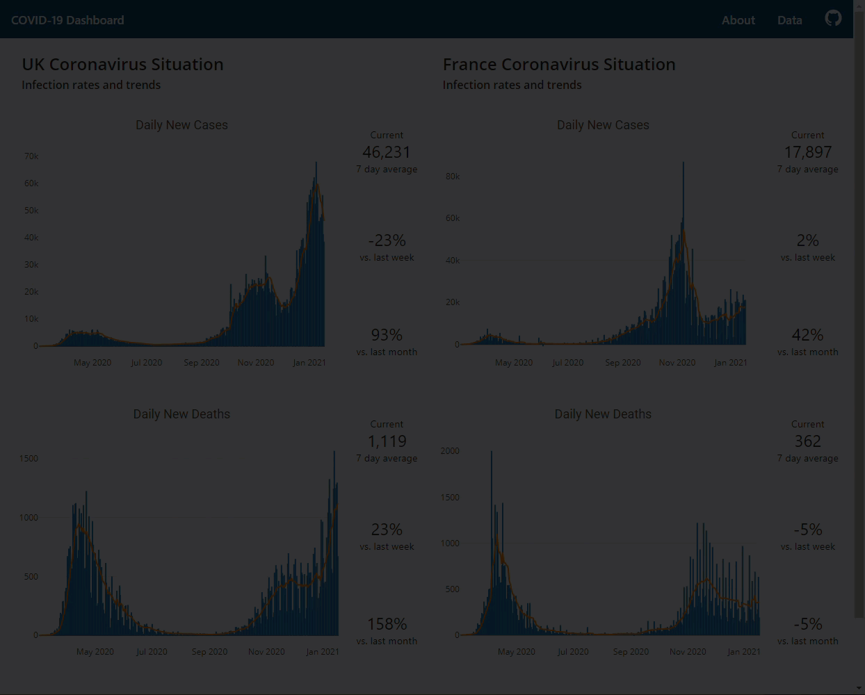
COVID-19 Flask dashboard to assess the situation in the UK and France
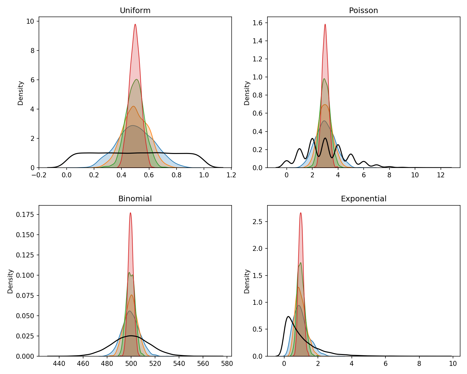
What is the Central Limit Theorem?

